Color Psychology: The Meaning and Effect of Hues
The meaning of colors has a much more significant impact on our daily lives than we realize. But what exactly is Color Psychology? How do colors influence our emotions?
Each of us associates certain feelings and thoughts with each unique hue. And in this article, we will explore the basics of color psychology, its practical applications, and how to use it to your benefit.
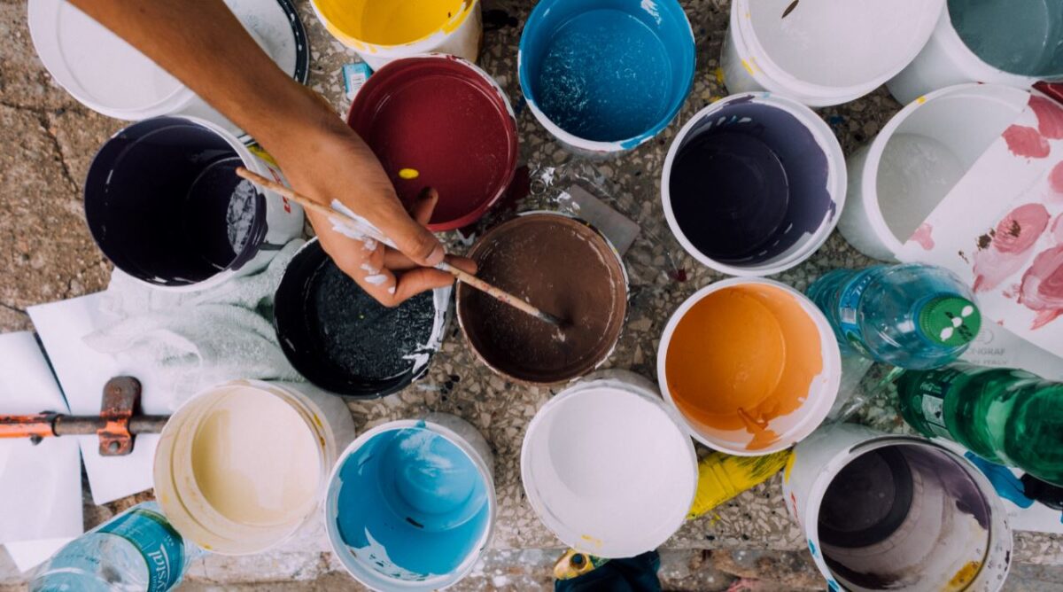
BEHIND THE PSYCHOLOGY
Colors can change our perception, alter our senses, excite us, and influence how we react to our surroundings in unique and exciting ways. They have the power to improve our memory and attention as well as influence us to make specific decisions.
Knowing the meaning of colors can help us better understand our behavior. We can then design environments that bring about emotional states that are more appropriate for that space.
For example…
Imagine a children’s toy.
You probably think of a brightly colored object with strong contrasts that overflows with energy and vitality. If we think of the same toy, but we paint it black with silver details, does it still give us the same feeling of curious youthful energy? In the past toys would be made of natural colors like wood or stone.
While there is no real “color code” for how everyday objects or environments should look, we still make associations between them. We usually don’t stop to think about it. However, we are instantly surprised if we see a blue banana, orange contact lenses, or a fluorescent yellow tree.
Color Psychology is a field of study that never stops developing.
Its dominance is vital for professionals such as creatives or for companies and new products that want to break into a new market. Designers and architects rely on this psychology to design clothing, cars, products, and homes – all in the name of eliciting different pleasant reactions.
INFLUENCING MENTAL STATES
Every moment, stimuli bombards our brains. From this, we carry out countless number tasks and choices each day. We have no time to process everything that zips through our sensory highway. That why are into brain training and improvement.
These unconscious associations we develop on such fundamental aspects of reality save us a great deal of time since they are processed automatically.
On top of it all, humans are deeply emotional creatures.
Colors interact with our memory, awaken feelings, and guide our reasoning. They remind us of nice things like the rain boots we wore when we jumped in puddles when we were young. But they can also irritate us, even make us ill.
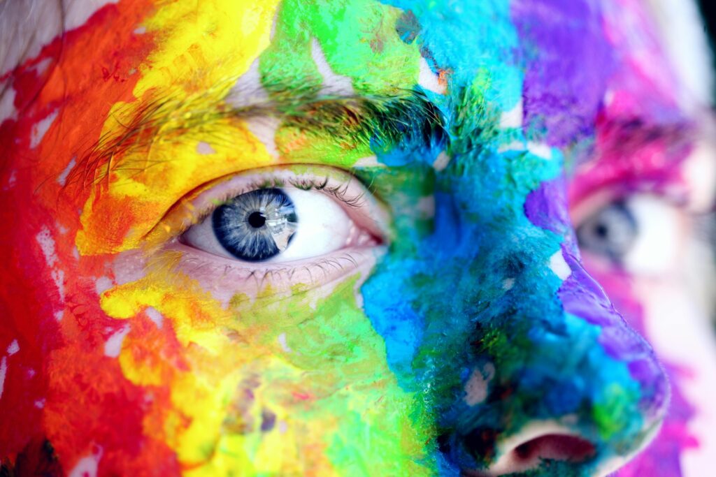
WHAT DOES EACH COLOR MEAN?
This issue has sparked passionate debate.
Professionals such as psychologists, sociologists, linguists, or market researchers each interpret the meaning of colors differently. They analyze phrases such as “being green with envy” or “seeing life through rose-colored glasses.”
Companies dump millions of dollars into studies on a single color – and every possible variation of reaction or emotion.
Let’s take a look at what some of the colors might mean and how they are used:
WHAT DOES WHITE MEAN?
It is the color of snow, milk, cotton, and wedding dresses. White often represents a new beginning, lightness, perfection, purity, peace, innocence, etc.
In hospitals, white is one of the predominant colors; it’s aseptic and transmits calm. White shirts are used to create a good impression since it is an immaculate and neutral color.
A blank sheet of paper opens the door to a world full of possibilities, but it can also give us a certain sense of anguish if we do not know how to use it.
HOW ABOUT YELLOW?
The color yellow is often linked to positive concepts such as optimism, youth, confidence, and creativity. As children, we painted our smiley faces yellow and would rarely dress in yellow on a sad day. It is the color of the sun, gold, or animals as friendly as giraffes or baby chicks.
However, yellow is a contradictory color. It is related to betrayal, greed, lies, madness, or warnings. Groups that have been excluded, such as those of the Jewish faith, prostitutes, or single mothers have found this color linked to them in some way. It should be noted that it is the most valued color in China and has nearly no negative meaning there.
THE MEANING OF ORANGE?
The color orange immediately captures attention. It’s also a “love it or hate it” hue – and for good reason.
This color is found in several fruits and vegetables or a beautiful sunset. According to Color Psychology, orange represents extravagance, energy, transformation, and the singular. It stimulates the appetite and brings on bursts of energy. It’s also connected to flamboyance, determination, and warmth.
And for any foodies out there, it might conjure the joy of pumpkin spice.
But on the flip side, it can be a very exhausting color if used too much, and it’s counted as most people’s least favorite shade. Couple that with the use of orange for many different kinds of “danger signs” and we can understand why it’s something to use with caution.
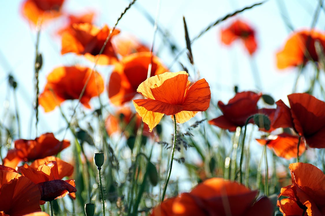
WHAT DOES RED MEAN?
Red is the most passionate color. it alarms us and captures our attention immediately.
Color Psychology tells us that red is linked to love, blood, joy, suspense, closeness, war, or the forbidden. Since it’s a color of urgency, it appears on stop signs and discount sale tags.
Dressing in red attracts the eye. It not only influences sexual attraction in humans, but animals love seeing red on each other as well! Lipstick “stains” on a shirt collar are always red, and so is the pen your teacher used to correct your assignments.
So, if you want to send an infallible message or be looked at, use red.
HOW ABOUT PINK?
According to the psychology of color, pink can represent sweetness, femininity, delicacy, charm, sensitivity, courtesy, illusion, or eroticism.
It can be “childish” by linking with youthfulness and innocence. But it also acquires nuances raised in tone by being the color of the nude (in many western cultures).
For anyone who loves pink, they love it wholeheartedly – as well as hating any stereotypical labels of irritating, sexist, or cheesy. The shade that receives the most criticism is fuchsia, because it’s associated with cheap and tacky products.
WHAT’S UP WITH PURPLE?
Purple is an unusual and enigmatic color.
It doesn’t appear in nature as much as its brethren and therefore stands out from the rest if used correctly. Purple is tied to the world of luxury (because of the pigment’s rarely in dyes back in the day), religion, and sexuality. Purple objects have an ambivalent and attractive aura.
It has been linked to homosexuality and adopted by feminism. It reflects nostalgia, fantasy, banality, ambition, or vanity. As we can see, it is a color with multiple ambiguous meanings that can have a lot of potential, if we want to use it creatively.
THE MEANING OF BLUE?
The color blue is the one the most people name as their favorite.
It symbolizes harmony, fidelity, sympathy, peace, serenity, trust, honesty, or communication. It should not surprise us that several social networks (and all kinds of corporations) use it in their logos.
However, it can also seem cold and distant. It is often unappetizing in foods (most foods we think of as blue are purple, such as blueberries). And it may also make us suspicious.
Even so, it is still ideal for many uses – such as painting a room if you want a more relaxed tone.
WHAT’S THE MEANING OF GREEN?

Green is the most natural color. It reminds us of grass, youth, hope, health, fertility, and wealth. It’s fresh and harmonious, evoking moments of peace, youth, and tranquility. Environmentally conscious people are called “green.”
Although most associations are pleasant, it is not an entirely innocent color. Green can also give rise to associated with poison or other dangerous substances.
WHAT DOES BROWN MEAN?
The color brown can represent laziness, sloth, dirt, vulgarity, or ugliness. It may seem bland and dated. The least appreciated color is brown.
However, brown is a color that has a significant presence around us and awakens multiple associations. It is the color of wood and autumn. Resistance, warmth, and pleasant homes are connected as well.
Then there are foods such as chocolate, and having a tan tone is highly valued in many western cultures today. In the last few years, it has found a new friend in the color blue.
HOW ABOUT GRAY?
According to Color Psychology, gray mainly symbolizes old age and sobriety as well as having a “dampening” effect.
It can be dark, mediocre, and bland or signify ‘gray’ areas where moral rules may not apply. On the other hand, gray also reminds us of elegance in fashion, diplomacy, intellect, and compromise.
Despite the idea of “with age comes wisdom”, as a culture we are adamant about hiding our grey hairs.
But before you brush this shade under the rug, remember that its neutral standing can be paired with other colors to really make them pop – which is useful for interior design.
WHAT DOES BLACK MEAN?
Color psychology tells us that black is closely related to the world of night, power, and death. It represents denial, mystery, mourning, hatred, or cruelty. People associate black cats with bad luck, and no one wants to have a black and stormy day. It is the end, a heavy and violent finish.
However, black is an elemental color in any closet and surrounds us everywhere. It is functional and handy to go to a party at night or look more elegant on an occasion that requires sobriety.
In the book Psychology of Color by Eva Heller, the meaning of these colors is deepened. It has been one of the primary sources of this article.
COLOR PSYCHOLOGY USED IN DIFFERENT CULTURES
A Berlin and Kay analysis stated that many cultures stood on common ground when it came to categorizing colors.
It’s believed that there are six primary colors, and the rest are grouped around these. The primary group also had common “beliefs” through different cultures, but the others begin to branch off in their associations.
For example…
It’s frowned upon in our society to appear with garish colors in a burial; we prefer dark tones such as black. However, many years ago in Europe, women used bright colors, and covered themselves with huge white cloths. In Asia, on the other hand, mourning is linked to white.
This color is best suited to ideas about reincarnation.
In fact, within our own cultures, the meanings of colors are not unchangeable.
Did you know that it was only in the 1920s that girls began to be dressed in pink and boys in blue? It eventually became the “norm” – even now we have pink/blue gender reveal parties. However, times are changing again, and plenty of people are criticizing the practice.
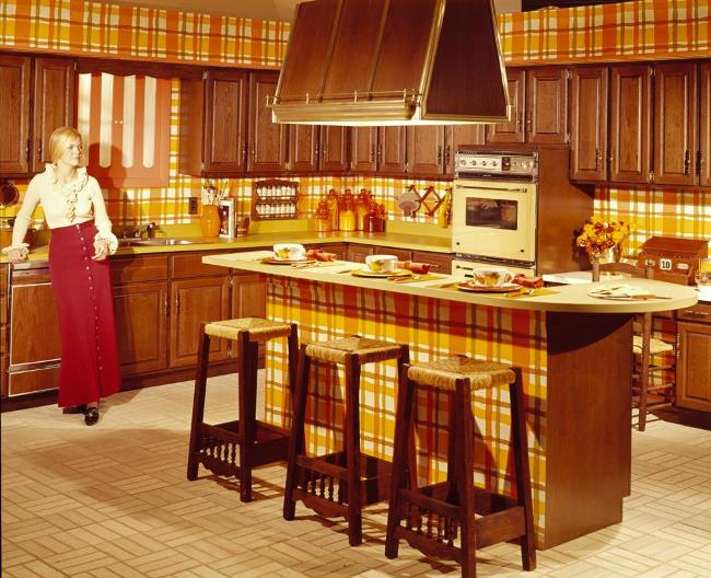
Colors can be associated with entire time periods. The ’60s and ’70s were orange, brown, and yellow. The ’80s was a rainbow of jarring neon that has only begun to appear again as the “new thing.”
In other words, over time, we redefine the meaning of colors and create new rules that may one day be forgotten.
The meanings of color vary even from person to person.
We can perceive them in one way or another depending on fashion, our emotional state, or the phase of life we are going through. For example, the preference for black decreases as age increases (not counting young children), as it acquires negative connotations.
And let’s not forget that not everyone sees the same colors – e.g. colorblind people.
There are even those with synesthesia who can “hear” them.
COLOR PSYCHOLOGY APPLICATIONS
- Colors have been used to try to cure diseases
- They are common in practically all the descriptions we make
- We tend to choose colors that fit our mood and that we think represent us
- Some b relationship between colors and personality
But if we dig deeper, we can find some very interesting stuff…
THE USE IN CREATIVES
Perhaps the first professions that come to mind when talking about colors and color psychology are the most related to creativity.
Designers (graphics, fashion, interiors, products, etc.), artists, advertisers, and other similar occupations need to know people’s minds to capture their attention and communicate with them. For example, we can see that the range of colors of a news channel is very different from that of a children’s program.
It’s a complicated mission to stand out in a society that’s saturated with images.
Still, it’s possible to better connect with the audience and create an emotional impact – and not always for the main goal of making money.
THE MEANING FOR COMPANIES
The corporate image of companies is fundamental.
What if someone asked you to name a red soft drink. We don’t need any more cues to know exactly which product they’re talking about. Brands condense their logo and the rest of their visual elements into a corporate persona. Colors are essential in marketing strategies.
Imagine a restaurant chain that uses a different logo color and advertisement pallet in each place differently. Our memory will be weaker and disorganized. As a result, that business will miss many opportunities to attract and retain customers.
We can see changes in the colors that companies use in their image depending on the characteristics of their audience and social trends. It is no coincidence that some brands go from their usual colors to green, which, as we know, is the ecological tone par excellence.
The thing is, colors are not only crucial for the public.
Employees can increase their well-being and increase productivity if they work in a place where they feel comfortable. An enclosed black space in low light can overwhelm workers and they will want to spend as little time as possible on their desks.
On the other hand, if we paint those walls white and put some touches of green and blue and others of warm colors (respecting the brand’s image), maybe it will be a cozier place.
MEANING IN OUR DAILY LIVES
Colors also affect us when making the most common decisions.
A common question right from when we are young is, “What’s your favorite color?” Everyone has their personal preferences. Think of any object, and it will probably come in every color imaginable. So, it’s likely that if a decision is not essential (a cup, for example), we will lean towards our favorite.
However, there are everyday situations in which we have to think about many more variables.
If we are going to buy a car, we have to be sure not to make mistakes. We will spend a lot of time with it, we may want something daring like orange, but it is possible that we get tired and regret the decision later.

On the other hand, a car of a more discreet color such as black or navy blue may be less visible at night. On the other hand, dirt is more noticeable on white and harder to see in winter storms.
There’s also a direct financial impact on your insurance – for example, red cars are associated with sports vehicles (and therefore speed) and are set at a higher insurance rate.
COLOR PSYCHOLOGY TIPS
1. Favorites are not always suitable
We’re likely to be passionate about purple, but maybe we’ll be distressed to spend too much time in our room if we’ve abused it. However, it is a perfect color to give any outfit a bit of splash. Especially if combined with others like orange.
Think about what the function of the object or space will be before choosing the color.
2. Context is essential
We know the importance of cultural variables and the circumstances of each situation when selecting a color.
Seeing a candidate for a lawyer position in a phosphorite green suit attend an interview could be illogical. However, we can always try to innovate and experiment with an extravagant and daring color combination, so we stand out from the crowd.
3. Learn how to combine
We may have to design a poster – and have thought about all aspects of color psychology. But there are more aspects to consider, such as the effect that two colors can have together.
For example, brown accompanied by gold, yellow, and orange represents autumn. However, if brown is presented next to gray and black, it becomes conservative and bland.
4. They must be functional
Who hasn’t bought a white piece of clothing while worrying about if it’s going to get stained? There are colors more resistant to dirt, others more suitable for heat, some are perfect if we want to go unnoticed, etc.
A good example is font color. While black on white is good with paper, modern web design uses dark grey instead. This is because it reduces eye strain.
As much as we like to write in light pink on white, black on yellow is infinitely more distinguishable. In fact, this is the combination that stands out the most. However, it’s also the most glaring and usually hints at warning or danger.
5. Use colors to improve memory
If you are preparing for an exam and don’t know how to remember all the steps of a boring list, try to relate each point to a color. Mnemonic rules encourage our learning.
Also, if you have to make a presentation, you can also improve your audience’s memory in this way as well. Use color psychology to highlight the most important thing you have to say and associate each color with its meaning.
6. Be consistent
This is especially important for companies and brand recognition.
If you have a business or are thinking about entrepreneurship, think carefully about what you want to convey. All the elements of your company must be congruent with each other. The help of a professional designer who takes these aspects into account can be essential to rescue a company or launch it successfully.
ENDING THOUGHTS
Our brains might be automatically trained to make color associations. And yes, it’s a good idea for businesses to stay consistent. But that doesn’t mean there’s no room for experimentation, innovation, or expressionism.
Explore, learn, and grow into the endless choices of color with our brain games.