
Colors That Calm the Mind: What Psychology and Cognitive Science Reveal
Have you ever felt a wave of calm wash over you while looking at a clear blue sky or walking through a green forest? That sensation isn’t just in your head. It’s grounded in psychology and brain science. Colors have a powerful influence on our mental and emotional states. From soothing anxiety to improving focus and memory, the right palette can do more than beautify a space — it can support our cognitive health. In this article, we’ll explore what psychology says about calming colors, how they affect the brain, and how you can use them in your environment and mindfulness practice to support mental balance.

Note: This article is intended for general information and educational purposes. It summarizes scientific research in accessible language for a broad audience and is not an official scientific press release.
Why Does Color Affect the Mind?
Our brains process color through the visual cortex, but its impact doesn’t stop there. Colors trigger emotional responses in the limbic system and influence decision-making in the prefrontal cortex. In short, color affects how we feel, focus, and think.
Studies show that color exposure can alter heart rate, blood pressure, and cortisol levels. This means colors don’t just change how we perceive the world — they change how our bodies and minds react to it.
What Psychology Says: Emotional and Cognitive Color Responses
Color psychology explores how hues influence mood, attention, and memory. For example, blue is widely recognized for its calming effects, while red can increase alertness and tension.
The connection between color and cognition is backed by research. Calm tones like blue and green have been shown to improve focus and reduce mental fatigue. Soft earthy tones help regulate emotions and restore mental clarity.
Colors That Calm the Mind (and What They Do in the Brain)
Let’s dive deeper into calming colors proven to soothe the nervous system and sharpen cognitive clarity. Each one has a distinct psychological impact and practical value in everyday settings. Whether you’re designing your workspace, picking out clothes, or creating a mindfulness routine, these colors can shape your emotional and cognitive state.
1. Light Blue & Sky Blue
Have you noticed how a blue sky immediately brings a sense of peace? That’s no accident. Light blue has been shown to reduce blood pressure and heart rate, easing the body into a state of relaxation. In neuroscience, this color stimulates the parasympathetic nervous system—responsible for rest and recovery.
Use it for: Virtual meeting backgrounds, meditation apps, or painting your home office. Add blue elements to your training environment to increase focus without overstimulating your brain.
Pro tip: Replace your phone wallpaper with a light blue gradient to reduce screen-induced anxiety.
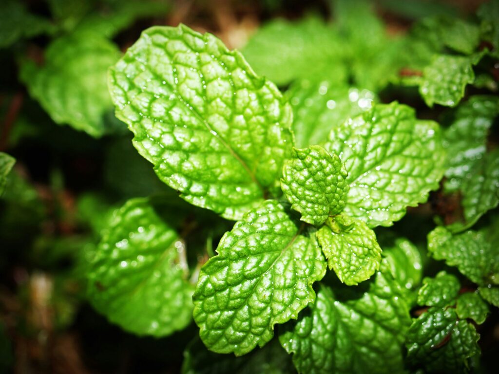
2. Soft Green or Mint
Green evokes nature — and with it, a sense of safety, balance, and calm. Studies show that even short exposure to green improves working memory and restores mental energy after intense cognitive tasks. It’s no wonder that green is used in classrooms and therapy centers.
Use it for: Bedrooms, hallways, journaling areas. Incorporate green plants or mint cushions to bring life and restoration into your space.
Pro tip: Go for a walk in a park during a mid-day break — your brain will thank you.
3. Lavender and Mauve
Lavender has long been associated with calm, especially in aromatherapy. Visually, it has similar effects. It’s a fusion of calming blue and nurturing pink, ideal for reducing cortisol and promoting rest. Neuroscience suggests that soft purples encourage emotional processing and introspection.
Use it for: Bedside lamps, evening lighting, guided sleep meditations. Wrap yourself in a lavender blanket or wear mauve at night to signal your brain it’s time to wind down.
Pro tip: During stressful workweeks, keep a lavender-scented sachet nearby for multisensory calm.
4. Light Gray
Not all calming colors are vibrant — some of the most powerful are the quietest. Soft gray provides your brain with a visual break. It doesn’t demand attention or trigger strong emotions, offering a neutral background where your mind can decompress. It also helps reduce decision fatigue by minimizing visual clutter.
Use it for: Minimalist home décor, mindfulness spaces, clean workstations.
Pro tip: Combine soft gray walls with green or blue accents to enhance cognitive calm without making the space feel cold.
5. Earth Tones: Sand, Terracotta, Soft Brown
Earth tones ground us. Psychologically, they evoke safety, belonging, and emotional warmth. These tones mirror nature’s textures — clay, wood, soil — and help regulate the limbic system, which processes emotion and memory.
Use it for: Yoga rooms, reading corners, therapy spaces. Terracotta cushions or beige throws add warmth and emotional grounding without overwhelming the space.
Pro tip: Mix earth tones with soft lighting for a cocoon-like atmosphere that supports emotional restoration.
6. Indigo or Deep Blue
This is the color of depth—mental, emotional, and spiritual. Indigo enhances introspection and contemplation. It’s linked to activity in the brain’s default mode network, which is active during rest and reflection.
Use it for: Creative studios, personal journaling areas, quiet corners in a busy home.
Pro tip: Use deep blue backgrounds in mindfulness apps or sleep playlists to invite stillness before bed.
7. Peach and Soft Coral
Often overlooked, these warm pastels bring emotional lightness without overstimulation. Unlike vivid orange, soft peach hues stimulate positive mood and can even combat emotional fatigue. They encourage self-expression and emotional openness.
Use it for: Mood-boosting morning routines, bathroom tiles, cozy blankets.
Pro tip: If you’re recovering from burnout or emotional exhaustion, surround yourself with coral or peach tones to slowly recharge.
8. Warm White and Off-White Tones
Often overlooked, soft whites and creamy neutrals offer a quiet kind of calm. Unlike stark white, which can feel cold or clinical, warm white tones create a sense of spaciousness without emptiness. Psychologically, they act as visual silence — letting the brain rest and reset.
Use it for: Bedroom walls, bathroom linens, minimalist meditation spaces. These tones work beautifully with natural materials like wood, linen, or stone.
Caution: Pure white — especially in sterile or dimly lit environments — can evoke feelings of isolation or tension (the “hospital effect”). Choose warm white, ivory, milk, or linen hues, especially for textiles and lighting.
9. Other Neutrals That Soothe the Mind
Beyond the core calming palette, some softer shades like greige, pastel aqua, or sand-gold tones provide gentle grounding without overstimulation. These can be especially useful in transitional areas or shared spaces, offering calm without dullness.

Colors to Avoid When You Seek Calm
Some colors are energizing — great for productivity, but not for peace.
- Bright Red: Stimulates the fight-or-flight response, raises tension
- Neon Yellow: Activates attention networks, may increase anxiety
- Intense Orange or Fuchsia: Can feel overwhelming, especially in large amounts
If your goal is to support mental recovery, keep these colors as accents rather than dominant tones.
How to Bring Calming Colors into Your Daily Life
Knowing that color can influence your mood is one thing — but living it is another. The real magic happens when you begin to incorporate calming hues into your everyday surroundings, your routine, and even your cognitive habits.
At Home
Your environment sets the tone for your mental state. Soften your space with walls in muted greens, cool blues, or warm grays. If repainting isn’t an option, lean on textiles: curtains, cushions, throws, or even artwork in relaxing tones can shift the entire feel of a room. These color cues can gently nudge your nervous system toward calm.
Create a dedicated area where your mind knows it’s safe to unwind — a corner with lavender lighting, a sandy beige armchair, or even a green plant can act as visual anchors for mental stillness.
In What You Wear
Our brains pick up emotional signals from everything — including our clothes. On high-stress days, opt for calming colors like soft blue, olive, or pale mauve. These shades don’t just reflect tranquility to others; they remind you to slow down and breathe.
On Your Screens
We spend hours each day looking at screens — why not make them gentler on the mind? Choose backgrounds or themes in sky blue, mint green, or warm gray. Especially during focus-heavy tasks, these tones can reduce visual tension.
At night, shift your device to a darker palette — deep indigos or low-contrast grays signal the brain that it’s time to power down.
In Cognitive Training
Here, color takes on a different role. In brain games by CogniFit, vibrant colors are used to keep you mentally engaged — supporting focus, reaction time, and visual accuracy. These exercises rely on dynamic color changes to stimulate thinking in a more active, playful way.
To complement this stimulation, balance your training space. If you’re working in a room with soft lighting and neutral tones, your brain can more easily switch between high performance and calm recovery.
For a more soothing cognitive experience, try programs like MindFit by CogniFit — especially in spaces designed with calming greens, blues, and beige. This pairing helps sustain focus while encouraging emotional regulation.

Make Color a Mindful Habit
Even subtle choices — like the mug you drink from, the notebook you use, or the blanket on your chair — can become rituals of calm if you choose their colors wisely. Let color support your mental clarity throughout the day, not just in moments of stress.
Ultimately, it’s not about perfection — it’s about creating an environment that quietly supports balance, focus, and emotional ease through thoughtful use of color.
What Science Really Says About Color, Stress, and Mental Clarity
The connection between color and the mind is more than just a feeling — it’s backed by psychology and neuroscience. Research shows that soft, calming colors like blue, green, and muted earth tones can reduce stress hormone levels and support clearer thinking, even in high-pressure environments.
People tend to make fewer mistakes, stay more focused, and feel more emotionally balanced in spaces designed with these tones. Classrooms, therapy offices, and recovery rooms often use this to their advantage — and you can, too.
Color isn’t just about what you see. It’s about how you feel, how you think, and how you move through your day.
Final Thoughts: Visual Calm as a Tool for Mental Clarity
In high-stress environments, the smallest sensory cues can make a difference. Calming colors — soft blues, gentle greens, muted earth tones — don’t just please the eye; they send signals of safety and stillness to the brain.
When paired with mindfulness practices like conscious breathing, body scans, or quiet cognitive reflection, these colors can help regulate emotions, improve focus, and reduce cognitive overload. The effect isn’t immediate or loud — it’s steady and grounding: a mental space that feels more anchored, more attentive, and more at ease.
You don’t need to transform your entire life. Just a few intentional choices in color and routine can shift how your mind responds to the world.
The information in this article is provided for informational purposes only and is not medical advice. For medical advice, please consult your doctor.